Hugo Award winner Chris Garcia is the editor and publisher of many regular internet magazines, or Fanzines, including The Drink Tank and Klaus at Gunpoint. When I started Book Judgement, Chris was one of the first people I told because I knew he had similar feelings for books. The subject line of the e-mail containing this submission simply read “Luscious Book!” Having seen this particular volume on the shelf at Borderlands Books in San Francisco on numerous occasions I was excited to see his review. I fear my next trip there will be a little more expensive than usual. – Ric Bretschneider, July 16, 2014
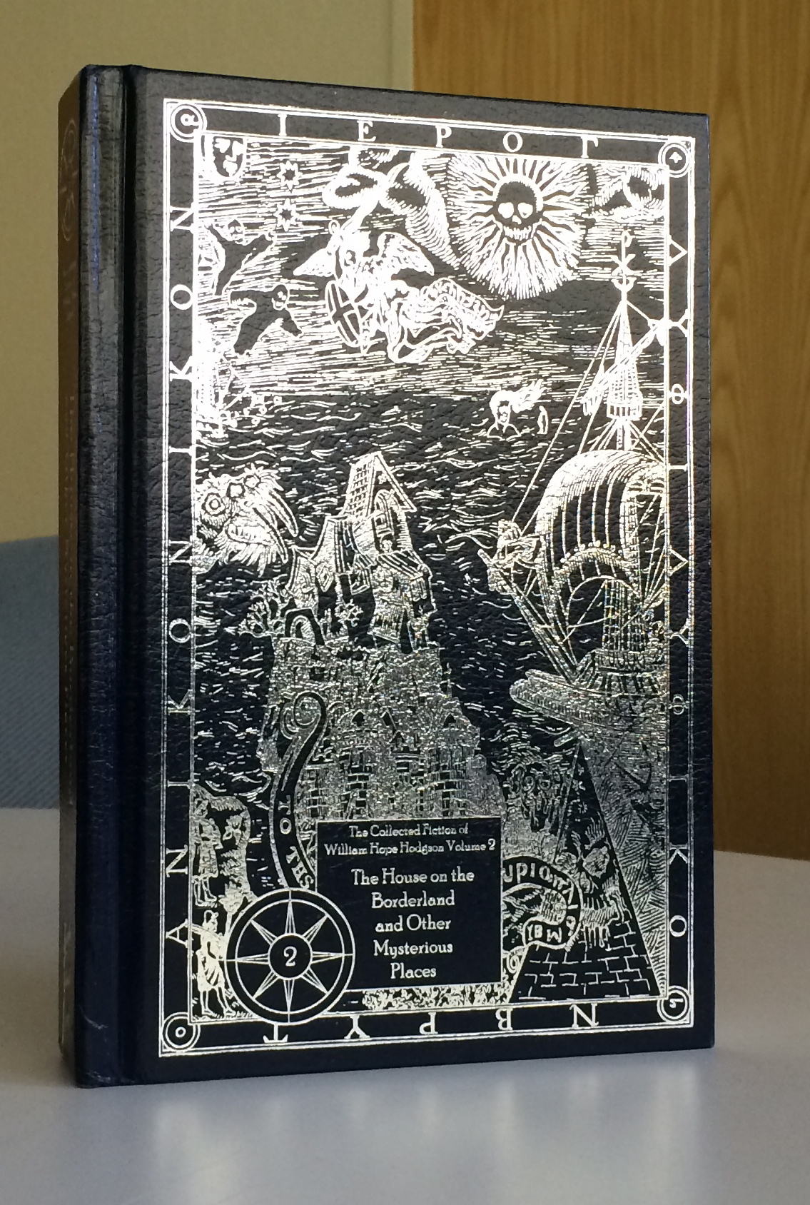
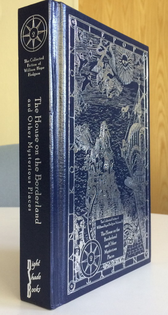
The Collected Fiction of William Hope Hodgson The House on the Borderlands and Other Mysterious Places
Christoper J. Garcia
There are few books I own that deserve the distinction of being called ‘luscious.’ In my eyes, that term requires a number of things. First, it must be a delight to hold; the kind of book that if you place it in one hand, the other MUST stroke the cover gently. Second, it must feel substantial, like you’re actually carrying something. Third, it must smell right. Old books have that, but once in a while a modern one will pass the sniff test.
This collection of W.H. Hodgson‘s stories is luscious.
A solid spine and gorgeous silver embossing
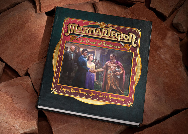
Let’s start with the obvious – the cover image. Jason VanHollander created a magnificently strange collection of characters all tied into one busy, but beautiful, image, embossed in silver, as the cover. The entire effect is difficult to photograph, but it’s lovely. It’s exactly the kind of image that should adorn both a volume of one of the premiere horror writers of the last ever, or a book called ‘luscious’. The image is repeated, in regular black ink, two pages in to the book. That image has the feeling of a wood-cut, and shows how remarkable that over image is.
The faux leather of the cover is really nice, and the choice of the dark blue adds to the antique feeling. It seems so appropriate that a book containing so many Carnacki stories (my favorite!) would be bound in deep blue like this. It imparts something of the feeling of those old tomes of the 19th Century, while at the same time not feeling like they’re going for that feeling by overdoing it. The back of the book has a lovely image of Hodgson stamped on it in the silver as well, which is a nice touch. That same image is also repeated in black ink in the book itself. I like that touch as it is much easier to appreciate on the regularly printed page.

It imparts something of the feeling of those old tomes of the 19th Century
The spine is interesting, and I say that in the English meaning of ‘Interesting’ (ie. Being of Interest) as opposed to the Chinese meaning (ie. any damn thing anyone wants to assign it, apparently) because it is what first drew me in. There’s a simple 8-point compass-like logo at the top identifying this as Book Two in the series of The Collected Fiction of William Hope Hodgson, and then the title and the lovely Night Shade Books logo at the bottom, all in that stamped silver again. It’s subtle, but not 21st Century subtle, but more 19th Century subtle, which is slightly busier, and easier to stand out. When I have this book among others on my shelf of Precious, Ornate, Expensive, and/or Luscious books, it stands out as one of the best-designed spines of all of ’em.
If there is one disappointment, and if I were a harder man it would hold it back from that Luscious moniker, it’s the endpapers. They’re white. Plain and simple. It’s not a bad thing, I get the choice, certainly, but they’re kind plain for a book presentation so richly complex. A splash of burgundy, or perhaps a little marbling? Anything but plain white!
Just enough of a serif on it to give it a slightly antique look
The font choice? Solid. Just enough of a serif on it to give it a slightly antique look. I think it’s called Plantaginate, and it’s pretty, while still managing to be clear. I always like that in a font!
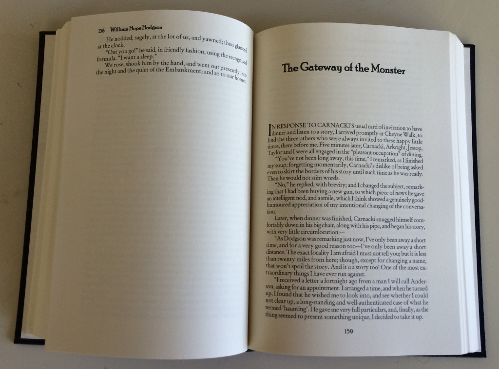
There’s a handy index in the back that talks about the first publication of the collected stories, and a bit of background on how they chose which version of the texts. That sort of thing is always useful, though it may fall a bit too close to content for this actual review!
All in all, Night Shade Books, and editor Jeremey Lassen, has given us as Luscious a book as you are likely to find out there at the price point. The fact that it’s a collection of one of the essential horror writers only amps up its Luscivity!
Christopher J. Garcia July 14, 2014
Click to Buy Now… 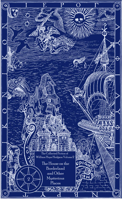
-30-


 One additional treat from the ERB Books site, this video showing the printing process used in producing Back to the Stone Age.