Inside Make on Demand Books

It might be a bit surprising to see me sharing a video about Amazon on Book Judgement, but as a technologist I found this exercise in automation fascinating. Make on Demand books (MOD) are becoming a big business, and expand the way that smaller press and relatively unknown authors can get their work in the hands of people who still prefer the feel of the book, and reading off paper.

I’ve bought a fair number of MOD books over the last few years, and while they’ll likely never going to win bookbinding awards, they’re typically paper glued into the cardboard spine of a paperback, I do appreciate having some of these defacto rarities on my bookshelves.


Recreating Mars… and Other Amazing Locales

Every copy came with an original plate!

If you stumbled upon a case of metal printing plates for some of the most seminal works in American publishing, what would you do? Sell them on eBay? Create plate crafts on Etsy? Well, if you were Jim Gerlach you would create a publishing company from scratch, learning everything you needed to know about printing and bookmaking to accurately recreate these lost treasures of history. We called Jim up to discuss his books, their history, and his plans for recreating some of the best loved works in English literature.

The Latest Addition: Boxed edition of A Princess of Mars

What was originally just a recording of a conversation so I didn’t have to take written notes struck me as perfect content for a Book Judgement podcast episode. It shouldn’t have been unexpected. I’ve produced over 560 episodes of The Fanboy Planet Podcast, so it was relatively simple to turn the recording into the streaming episode available below. You can listen to the episode at the bottom of this page (just click Play) or download to listen to it later (on a plane, or somewhere you don’t have an Internet connection.)

The Martian Legion, one of Book Judgement’s first reviews!

So enjoy learning how the original Edgar Rice Burroughs (did you know he was self-published?) books came to be, and how one guy lucked into building and extending an amazing set of collectable recreations of those historic works.

One additional treat from the ERB Books site, this video showing the printing process used in producing  Back to the Stone Age.

More on the production of the book is available here.

Mentioned in this Episode

Ric Bretschneider
February 2020

Podcast

Ithica Scrollery

Ithaca Scrollery

I have to say that this is going to be an unusual post, mostly because of time allowed.  I only learned about this project a few minutes ago, and I’m intrigued.  I haven’t backed it yet, but I’m going to be looking into it.

So without further ado, Ithaca Scrollery…

https://www.kickstarter.com/projects/729554200/ithaca-scrollery

There are 11 days left to pledge, but many of the books I’d be interested in have already sold though their limited printings.  If I get more information than what is listed on their Kickstarter page, I’ll update here.

Ric Bretschneider
San Jose
January 15, 2019 9:43 AM

Book Binding Explained in Three and a Half Minutes…

This is a book porn video.

But really, this video explains, in three minutes twenty-nine minutes, the basics of book binding as defined in the 16th century.  While much of this is automated today, and some corners are cut, the basics of book binding are pretty much unchanged in 500 years.

Enjoy.

(If the music bothers you, mute it.  There’s no value to the sound in understanding the subject.)

The Martian Legion – A Preview Review

It’s beautiful. It’s limited. It’s amazingly bound and illustrated. It’s expensive, the cheapest edition is $200, the highest is $7000.

And it must be mine.

It’s only fair to say I know nothing more about Jake Saunders’ The Martian Legion: In Quest of Xonthron than what I’ve read on the web site, and yet I’m totally sold.  It is a lovely, leather bound, boxed, and amazing composition of compelling art and presentation. The book’s story feels composed to specifically capture my attention; all my childhood heroes from so many divergent backgrounds, somehow joined in a single tale, a single huge volume of pulp fiction wonderment.

Tarzan, John Carter, Doc Savage, The Shadow, Carson Napier, Alley Oop… the list goes on and on.

The fun is in picking the heroes out of the crowd. The amazing artwork here is just stunning.

The fun is in picking the heroes out of the crowd. The amazing artwork here is just stunning.

At it’s heart, this is a new Edgar Rice Burroughs story, “told” to an ancestor of Jake Saunders for publication later. That’s a common enough trope, but this takes it to a new depth. It’s also a ‘what it’ mash-up of so many legendary pulp heroes all in the same book, all in the same adventure. The titular focus is John Carter, the Warlord of Mars and hero of “A Princess of Mars” and the remainder of that series. Classic, and a personal favorite of mine being that it was the first chapter book I recall picking out for myself as a young reader, with the approval of my mother who had read them herself in her younger days. The idea that Carter meets and adventures alongside so many other great heroes of that age is compellingly wonderful.

It's a heroic "Where's Waldo" of illustrative awesomeness.

It’s a heroic “Where’s Waldo” of illustrative awesomeness.

The first thing to catch my eye was the exquisite leather binding, with gold embossing and full-color inset picture on the cover. Garish? No! It’s totally a homage to the feel of pulp adventure, as if the book itself were an artifact of the story.  This is so wonderfully over the top, there’s absolutely nothing understated in this presentation.  It’s a huge tome, waiting to be opened by a magic spell.  OK, a magic spell of several hundred dollars…

A gathering of heroes.

A gathering of heroes. One of over 130 illustrations!

Next, sending me deeper into a book-lust state, the art is evocative of nearly every artist who has worked in the genre. From cleanly serviceable to lush and imaginative, the art I’ve seen so far is representative of the best in the industry. It evokes every aspect of pulp heroics.

Absolutely lovely artwork, ranking with that of Frazetta or Clinton Pettee.

Absolutely lovely artwork, ranking with that of Frazetta or Clinton Pettee.

Those two aspects alone would sell me, admittedly perhaps on a somewhat less pricey volume, but the presentation as a whole is breathtaking. Bejeweled and embossed box for the weighty volume, I’ve paid more for less. And I’ll be the first to admit the Martian coins are a bit of an overkill, but they do go a long ways towards establishing the exclusivity of the package.

Boxed with Martian coin!

Boxed with Martian coin!

So, it’s just a matter of time before I pull the trigger on this purchase. And some time after that I’ll provide you with a hands-on review of the book itself.

Watch for it.

The Martian Legion, a beautiful book, a historic partnering of heroes, a must buy.

The Martian Legion, a beautiful book, a historic partnering of heroes, a must buy.

More information can be found on the web site at www.themartianlegion.com/

Codex Seraphinianus

Codex Seraphinianus

by Luigi Serafini

There’s this thing in Star Trek, Star Wars, Guardian’s of the Galaxy, that nobody ever talks about. Talking that is.

IMG_2427Characters in science fiction all speak English. Sometimes they cover it by calling it a different language, like Common, or Universal, or Terran, but they never actually explain why it’s typically 20th or 21st Century English. We know the reason of course. That if the language were actually alien nobody would go see the film (cf. the sad state of subtitled film acceptance in post-Bush America today.)

It’s not just movies. Even the most alien of science fiction books have their characters basically tossing around English, right down to slang and common phrases like “don’t make me hurt you” or “he burned for her” or “they would never get together after all.” The slang is just as much a way to move the reader to understanding and being comfortable with the otherwise alien situation. And books are not as guilty here as movies, at least have the excuse that they’re very hard to subtitle. And again, using English is a short-cut to speaking to the reader, to making contact in a manner that can be understood.

fantastic_planet1

Fantastic Planet (1973)

Some experimental films, like René Laloux’s alien planet masterpiece Fantastic Planet do attempt break the barrier here. By eliminating all language and presenting a truly alien story, where the viewer is meant to interpret some level of “what’s going on” Laloux creates fully realized aliens, alien to us to the film itself. But to consider a similar attitude in a book is a very hard concept. It would take a monumental effort, real discipline and awareness, and it would constitute a real commercial risk, one that might never find an audience.


Of course it would help if an alien wrote it.

In 1981 an Italian artist, architect, and industrial designer named Luigi Serafini worked for three years crafting an alien artifact that pushed the concepts of beauty, alienation, and book craft to new dimensions.

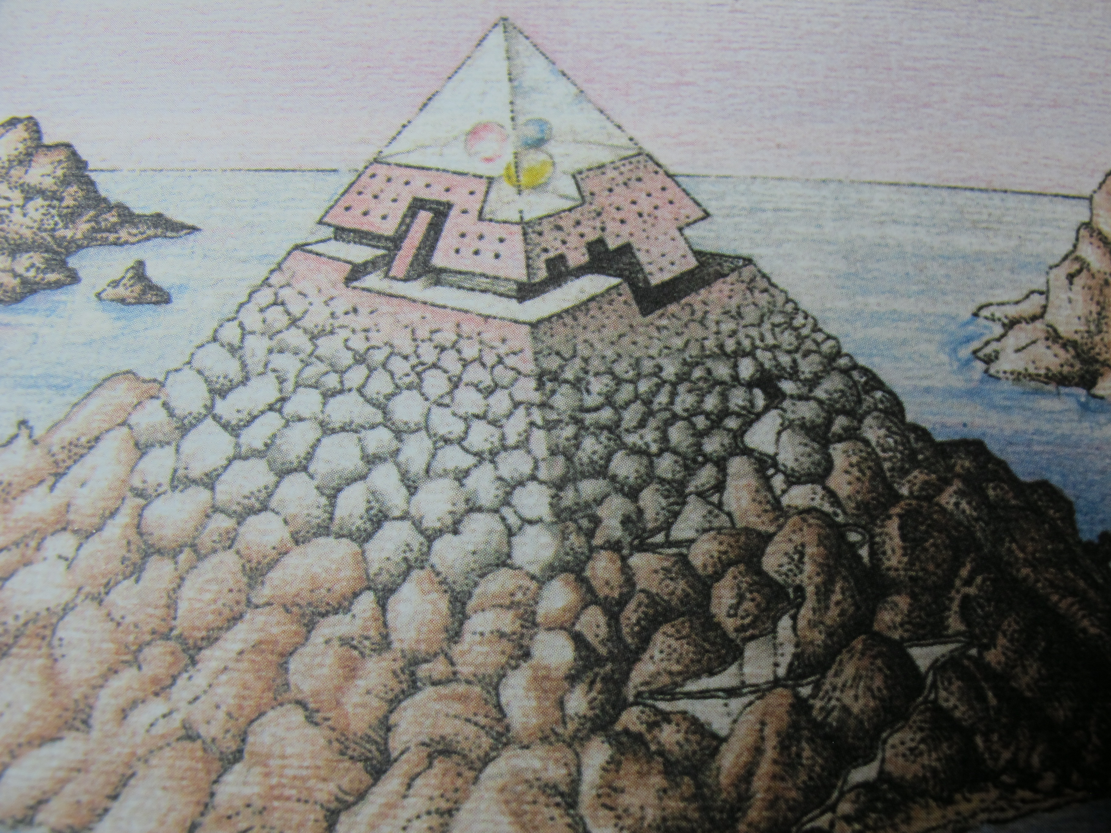
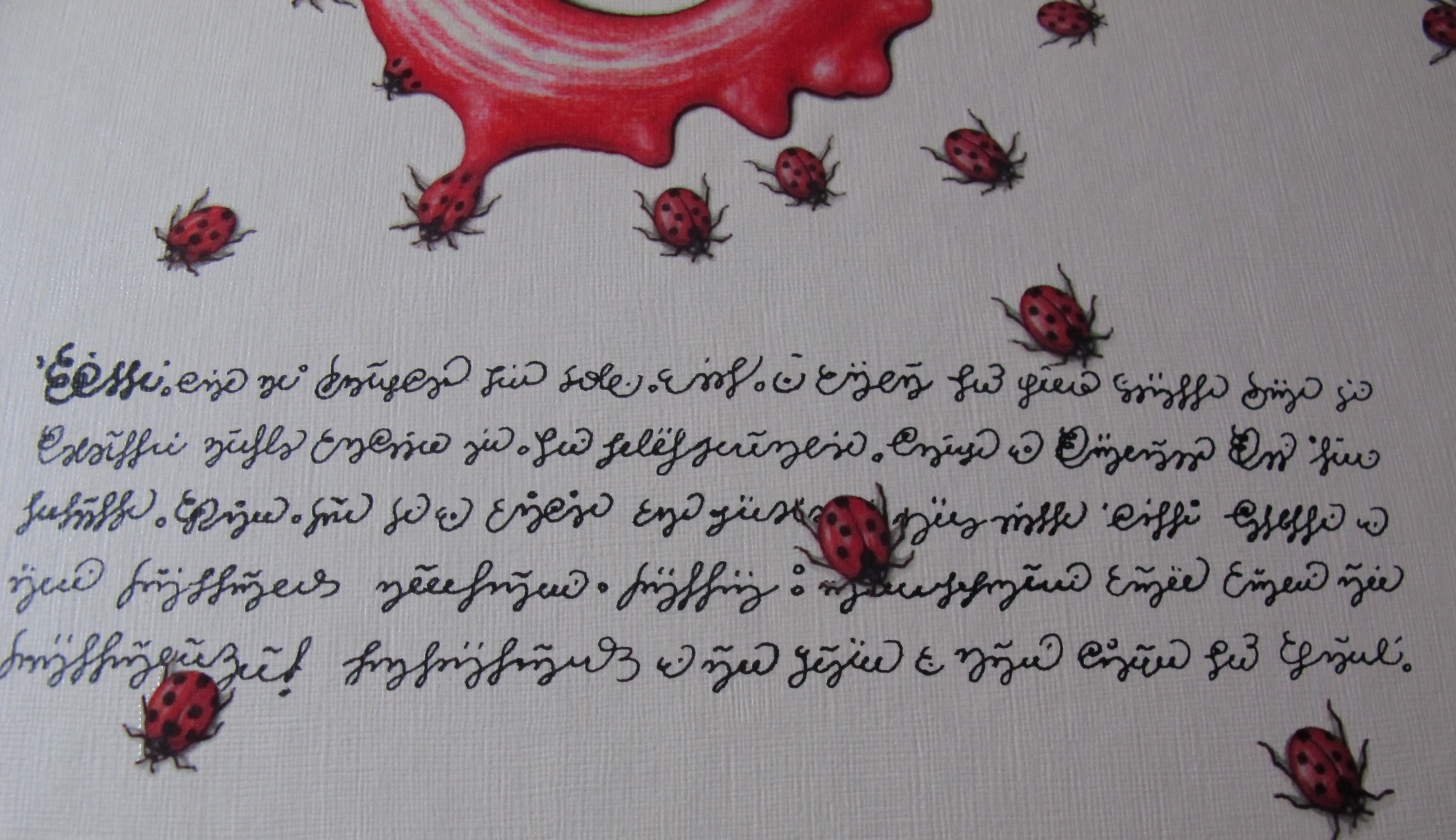
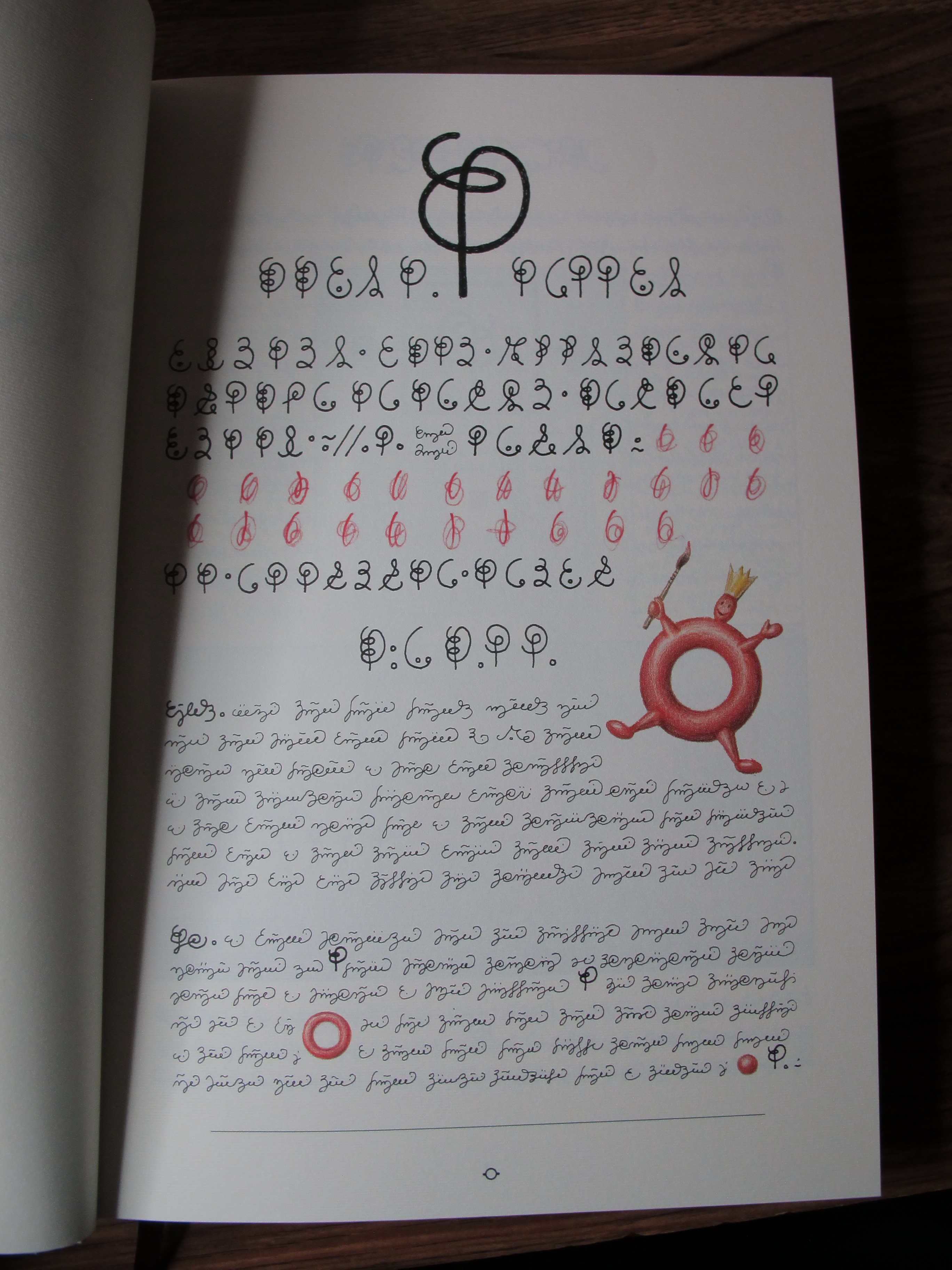
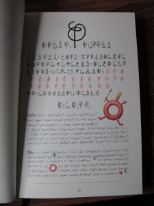
Serafini created a tome, thick and large, embellished with impenetrable glyphs and symbols that by style and repetition of forms can be nothing but a language, but one no human has ever spoken.IMG_2413

It is not in the tradition of Book Judgement to review content, and so we’ll not make any attempt at interpreting this entirely opaque work for its literary value. It may not have any except to be an undeniably professional work whose goal was to be entirely interpretable.IMG_2418

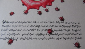
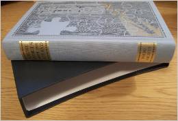
Instead let’s dwell on the construction of this magnificent volume. Starting with the cover we’re presented with a work that is visually and tactility stimulating. Photo-realistic painting of bugs (Birthed from? Escaping? I’ll not interpret.) some kind of fluid splash is combined with gold gilt lettering. It’s reminiscent of the simpler works of MC Escher. These are further enhanced by spot lacquering that is a joy to run your fingers over, giving the colored images additional depth you can feel.

IMG_2419The book’s height is reminiscent of illuminated manuscripts, and to be sure there is a ribbon protruding from the bottom of its pages.  I do so love book ribbons.

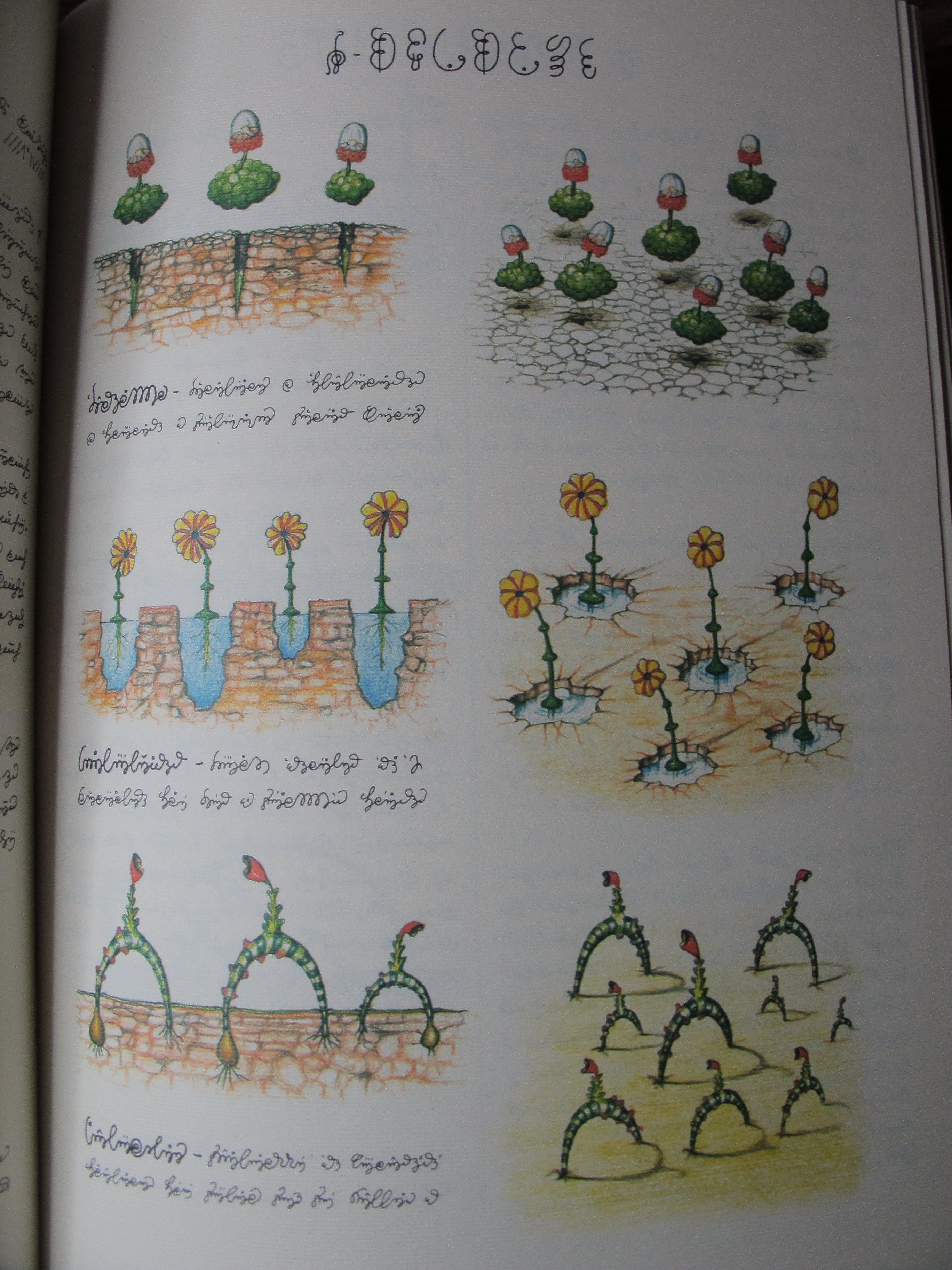
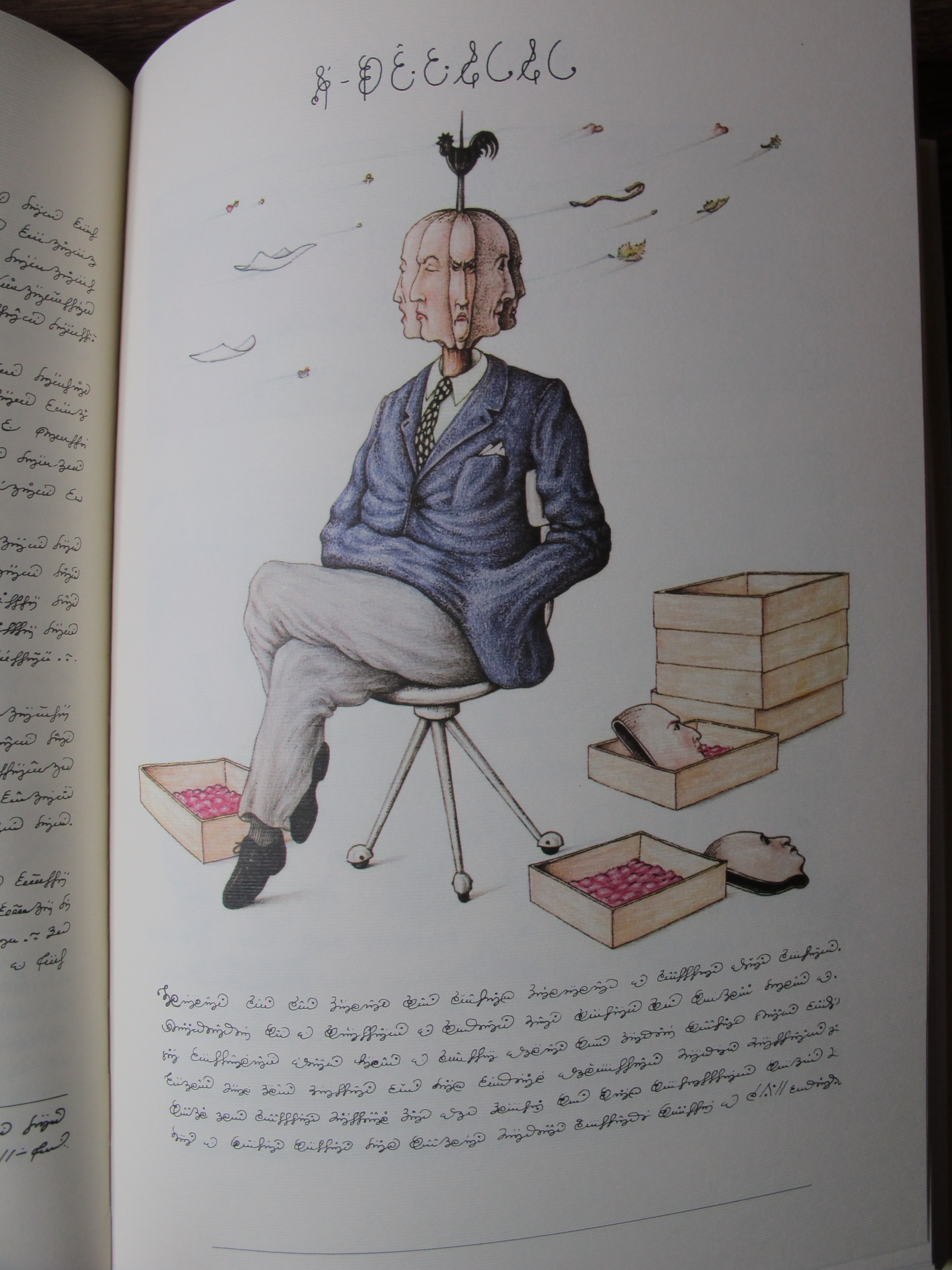
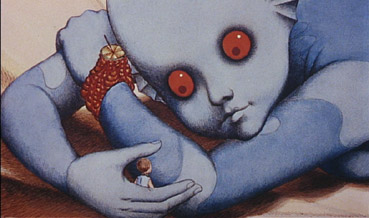
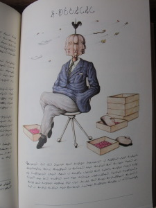
It’s impossible not to flip through the book, looking for a keystone, a Rosetta stone, that will give you some form of orientation. It does seem to be organized, biologically, physical sciences, the arts? Who can tell. At one point we’re looking at maps, the next strange machines. The colors are vibrant, the images compelling and strange. IMG_2421
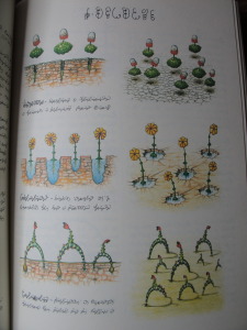
They’re often just familiar enough, but then the familiarity fades and strangeness returns.

It reportedly took just under three years for Serafini to complete the work. It’s amazing that it was that quick an effort. The script used on every page in this work is hand drawn. The numbering system for the pages, impenetrable, undeniably charting progress through the pages, but similarly alien. Familiar, like a race memory.

Another pleasure to the senses is the paper used. Heavy stock and textured. A prominent but fine horizontal grain on every page reminds you that this is a work of wonder, to be slowly explored like preciously gained treasure.IMG_2425

And there are slice of life images of the so-like-us-yet-undeniably-alien individuals whose lives, inventions, problems, adornments, and perhaps history (?) are colorfully illustrated without explanation.

IMG_2424Codex Seraphinianus is a luxurious puzzle with no hope of solution.  It is an alien landscape captured in the finest aspects of book construction and design. While you can’t quite yet journey to a truly alien landscape, and our world continues to shrink to the point that we can visit lands where we can’t speak the native tongue and have no clue as to polite custom, it’s reassuring that the power of a luxurious book can still transport us there from the overstuffed chair of our reading nook.IMG_2422


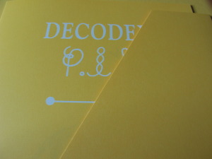
There is a Decodex pamphlet hiding in a pocket in the inside back cover of the volume that purports to be an explanation of the author’s inspiration and composition of the work, in several languages.  This is undoubtedly a fraud, there is no way this work was composed without alien influence, without a mind too strange for ours to fully grasp. I recommend leaving it unread, unexposed, and the rest of the experience unspoiled by this unfortunate comforting fiction.

IMG_2426

Ric Bretschneider
September 30, 2014

Squidder…

squidder

I backed the Kickstarter for Ben Templesmith’s The Squidder graphic novel in the somewhat reserved position of simply pledging for the hardcover version.  Now they’re letting us upgrade to the slipcover edition if, after having seen much of the work in e-book format, we’re having remorse for not doing so originally.

I felt I was strong enough to resist, but I made the mistake of checking out the video preview of the slipcased edition.

Yeah, this guy knows how to sell me on the upgrade. I think it was when he mentioned the book’s smell.

I’m doomed.

THE SQUIDDER – Update 13 from 44FLOOD on Vimeo.

Ric Bretschneider
September 6, 2014

The Star Wars – Boxed Deluxe Edition Special Unboxing Review

Great book presentations can come from anywhere. Comics for example.

Last year, Dark House press took a somewhat notorious, very early draft of George Lucas’ Star Wars and serialized it in comics.  The comic series is probably the closest that rendition this early Star Wars history will come to in a visual media.  The story is very different from the one we saw in Star Wars: A New Hope, characters, aliens, technology, even the force itself changed in subtle to extreme ways.  It’s an entertaining read for any Star Wars fan.

Evernote_Premium

The Star Wars franchise has a long history in the comic form, the individual movie serializations and additional stories made up for the time between films and were quite successful for Marvel comics.  More recently, Dark Horse comics has taken the Star Wars Expanded Universe into some amazing storylines far beyond the film canon.

And it was really no surprise that Dark Horse put a tremendous amount of effort into a boxed edition of the collected seminal work. This set of three volumes of material is presented in a sturdy and attractive cloth-covered, foil lettered and embossed box, the design repeated for the three volumes enclosed.

I suspected it would be a fun “unboxing” review to record for your enjoyment, so here it is…

The Star Wars: Boxed Limited Edition – Unboxing Review

You can find this edition for sale now, but I’d act on it soon because who knows when it will sell out!

Ric Bretschneider
September 4, 2014

A Book That Must Be Called Luscious

Hugo Award winner Chris Garcia is the editor and publisher of many regular internet magazines, or Fanzines, including The Drink Tank and Klaus at Gunpoint. When I started Book Judgement, Chris was one of the first people I told because I knew he had similar feelings for books. The subject line of the e-mail containing this submission simply read “Luscious Book!‏” Having seen this particular volume on the shelf at Borderlands Books in San Francisco on numerous occasions I was excited to see his review.  I fear my next trip there will be a little more expensive than usual. – Ric Bretschneider, July 16, 2014

The Collected Fiction of William Hope Hodgson The House on the Borderlands and Other Mysterious Places

Christoper J. Garcia

There are few books I own that deserve the distinction of being called ‘luscious.’ In my eyes, that term requires a number of things. First, it must be a delight to hold; the kind of book that if you place it in one hand, the other MUST stroke the cover gently. Second, it must feel substantial, like you’re actually carrying something. Third, it must smell right. Old books have that, but once in a while a modern one will pass the sniff test.

This collection of W.H. Hodgson‘s stories is luscious.

lucious2

A solid spine and gorgeous silver embossing

Let’s start with the obvious – the cover image. Jason VanHollander created a magnificently strange collection of characters all tied into one busy, but beautiful, image, embossed in silver, as the cover. The entire effect is difficult to photograph, but it’s lovely. It’s exactly the kind of image that should adorn both a volume of one of the premiere horror writers of the last ever, or a book called ‘luscious’. The image is repeated, in regular black ink, two pages in to the book. That image has the feeling of a wood-cut, and shows how remarkable that over image is.

The faux leather of the cover is really nice, and the choice of the dark blue adds to the antique feeling. It seems so appropriate that a book containing so many Carnacki stories (my favorite!) would be bound in deep blue like this. It imparts something of the feeling of those old tomes of the 19th Century, while at the same time not feeling like they’re going for that feeling by overdoing it. The back of the book has a lovely image of Hodgson stamped on it in the silver as well, which is a nice touch. That same image is also repeated in black ink in the book itself. I like that touch as it is much easier to appreciate on the regularly printed page.

lucious3

It imparts something of the feeling of those old tomes of the 19th Century

The spine is interesting, and I say that in the English meaning of ‘Interesting’ (ie. Being of Interest) as opposed to the Chinese meaning (ie. any damn thing anyone wants to assign it, apparently) because it is what first drew me in. There’s a simple 8-point compass-like logo at the top identifying this as Book Two in the series of The Collected Fiction of William Hope Hodgson, and then the title and the lovely Night Shade Books logo at the bottom, all in that stamped silver again. It’s subtle, but not 21st Century subtle, but more 19th Century subtle, which is slightly busier, and easier to stand out. When I have this book among others on my shelf of Precious, Ornate, Expensive, and/or Luscious books, it stands out as one of the best-designed spines of all of ’em.

If there is one disappointment, and if I were a harder man it would hold it back from that Luscious moniker, it’s the endpapers. They’re white. Plain and simple. It’s not a bad thing, I get the choice, certainly, but they’re kind plain for a book presentation so richly complex. A splash of burgundy, or perhaps a little marbling? Anything but plain white!

lucious1

Just enough of a serif on it to give it a slightly antique look

The font choice? Solid. Just enough of a serif on it to give it a slightly antique look. I think it’s called Plantaginate, and it’s pretty, while still managing to be clear. I always like that in a font!

There’s a handy index in the back that talks about the first publication of the collected stories, and a bit of background on how they chose which version of the texts. That sort of thing is always useful, though it may fall a bit too close to content for this actual review!

All in all, Night Shade Books, and editor Jeremey Lassen, has given us as Luscious a book as you are likely to find out there at the price point. The fact that it’s a collection of one of the essential horror writers only amps up its Luscivity!

Christopher J. Garcia July 14, 2014


Click to Buy Now… The_House_on_the_Borderland_and_Other_Mysterious_Places__The_Collected_Fiction_of_William_Hope_Hodgson__Vol__2___William_Hope_Hodgson__Jason_Van_Hollander__9781892389404__Amazon_com__Books

-30-

Crime Stories from The Strand

I’m pleased to welcome our first guest post, by the prolific Hugo Award winning Christopher J Garcia. You can read more of Chris via his numerous fanzines and podcasts and undoubtedly occasional posts here on Book Judgement. I’m sure not all will be so criminal. -Ric Bretschneider

Crime Stories from The StrandIMG_2211
1991 London Folio Society

Review by Christopher J Garcia – AKA @johnnyeponymous 

Why would you wrap a beautiful work of art in a plain bronze wrapper? It’s like the way Brighton Pavilion would cover over the lovely wallpaper and trim of one time period with the drab paint of the next. Sadly, that’s exactly what the folks at Folio Society have done with their release of Crime Stories of The Strand.

You remember the Strand, right? That hugely important English magazine that was the most important periodical from 1900 to the start of World War I. It was so popular that there was an American edition as well. HALF A MILLION copies a month. Imagine that happening today. It was an unstoppable jugglenaut of a magazine! Now, the London Folio Society put together this lovely collection of stories, ranging from Arthur Conan Doyle and G.K. Chesterton, to a certain Agatha Christie.

And the cover, a lovely puzzle-themed, two-color piece with exemplary cross-hatching and woodcut line work. It’s a marvelous work, lovely, giving off an Edward Gorey-like vibe. David Eccles The purple-blue of the hardcover shows through the black-and-gold printing and it’s spectacular.

Then the fools put a dull gold hard book box around it!

Unsleeved

Why would you do that? There’s literally nothing on the case! It’s a dull gold box which gives no impression of what’s inside. The spine shows two chunks of gold background indicating the title and Folio Society. THAT”S IT! They completely obscured the incredibly beautiful image with that lame lamé case. It’s an unfortunate decision, and I’d keep it on the shelf not in the slipcase if it wouldn’t feel like it were no longer Mint In Box!

The choices for binding and hardcover board choices are pretty solid. The binding does have a certain stiffness to it, which leads to a cracking sound, perhaps aided by the fact that the whole thing is compressed every time you put it back into the dull gold slipcase! The outer fabric is the ideal cover tone, in that purple-blue that reminds me of pipe smoke in Grandpa’s den. The endpapers are in a lovely wine and is the perfect counterpoint to the purple-blue.

The typeface, Ehrhardt, is clear and feels somewhat antique, but not overly so. In fact, it feels Modern. Not contemporary, but solidly, and notably, modernist. I love that!

The book was designed by David Eccles, including the text and the binding, which shows in his artworks, which are not only line drawings, but also some beautiful stipple art. I love Stippling!

All in all, it’s a wonderful product, sturdy, with heavy paper and richly inked text. The edge coloring is in that same wine tone, which is only done on the top of the book, though it really doesn’t matter, BECAUSE IT’S COVERED BY THE BREAKING SLIPCASE!

It’s clear this work has been a labor of love, and obviously well-done, as you would expect from the London Folio Society!

Christopher J. Garcia
July 9, 2014

Buy to support this site…

strand
-30-