Codex Seraphinianus
by Luigi Serafini
There’s this thing in Star Trek, Star Wars, Guardian’s of the Galaxy, that nobody ever talks about. Talking that is.
 Characters in science fiction all speak English. Sometimes they cover it by calling it a different language, like Common, or Universal, or Terran, but they never actually explain why it’s typically 20th or 21st Century English. We know the reason of course. That if the language were actually alien nobody would go see the film (cf. the sad state of subtitled film acceptance in post-Bush America today.)
It’s not just movies. Even the most alien of science fiction books have their characters basically tossing around English, right down to slang and common phrases like “don’t make me hurt you” or “he burned for her” or “they would never get together after all.” The slang is just as much a way to move the reader to understanding and being comfortable with the otherwise alien situation. And books are not as guilty here as movies, at least have the excuse that they’re very hard to subtitle. And again, using English is a short-cut to speaking to the reader, to making contact in a manner that can be understood.

Fantastic Planet (1973)
Some experimental films, like René Laloux’s alien planet masterpiece Fantastic Planet do attempt break the barrier here. By eliminating all language and presenting a truly alien story, where the viewer is meant to interpret some level of “what’s going on” Laloux creates fully realized aliens, alien to us to the film itself. But to consider a similar attitude in a book is a very hard concept. It would take a monumental effort, real discipline and awareness, and it would constitute a real commercial risk, one that might never find an audience.

Of course it would help if an alien wrote it.
In 1981 an Italian artist, architect, and industrial designer named Luigi Serafini worked for three years crafting an alien artifact that pushed the concepts of beauty, alienation, and book craft to new dimensions.
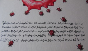
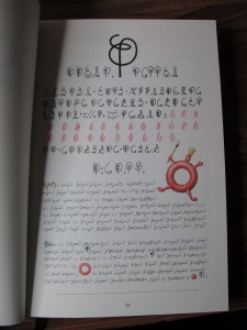
Serafini created a tome, thick and large, embellished with impenetrable glyphs and symbols that by style and repetition of forms can be nothing but a language, but one no human has ever spoken.
It is not in the tradition of Book Judgement to review content, and so we’ll not make any attempt at interpreting this entirely opaque work for its literary value. It may not have any except to be an undeniably professional work whose goal was to be entirely interpretable.
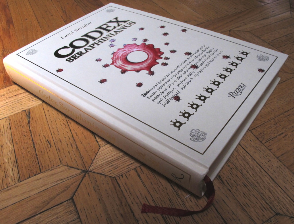
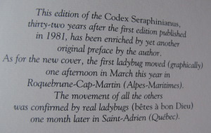
Instead let’s dwell on the construction of this magnificent volume. Starting with the cover we’re presented with a work that is visually and tactility stimulating. Photo-realistic painting of bugs (Birthed from? Escaping? I’ll not interpret.) some kind of fluid splash is combined with gold gilt lettering. It’s reminiscent of the simpler works of MC Escher. These are further enhanced by spot lacquering that is a joy to run your fingers over, giving the colored images additional depth you can feel.
 The book’s height is reminiscent of illuminated manuscripts, and to be sure there is a ribbon protruding from the bottom of its pages. I do so love book ribbons.
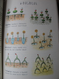
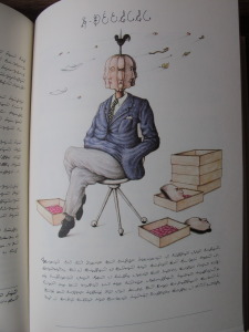
It’s impossible not to flip through the book, looking for a keystone, a Rosetta stone, that will give you some form of orientation. It does seem to be organized, biologically, physical sciences, the arts? Who can tell. At one point we’re looking at maps, the next strange machines. The colors are vibrant, the images compelling and strange.  They’re often just familiar enough, but then the familiarity fades and strangeness returns.
It reportedly took just under three years for Serafini to complete the work. It’s amazing that it was that quick an effort. The script used on every page in this work is hand drawn. The numbering system for the pages, impenetrable, undeniably charting progress through the pages, but similarly alien. Familiar, like a race memory.
Another pleasure to the senses is the paper used. Heavy stock and textured. A prominent but fine horizontal grain on every page reminds you that this is a work of wonder, to be slowly explored like preciously gained treasure.
And there are slice of life images of the so-like-us-yet-undeniably-alien individuals whose lives, inventions, problems, adornments, and perhaps history (?) are colorfully illustrated without explanation.
 Codex Seraphinianus is a luxurious puzzle with no hope of solution. It is an alien landscape captured in the finest aspects of book construction and design. While you can’t quite yet journey to a truly alien landscape, and our world continues to shrink to the point that we can visit lands where we can’t speak the native tongue and have no clue as to polite custom, it’s reassuring that the power of a luxurious book can still transport us there from the overstuffed chair of our reading nook.
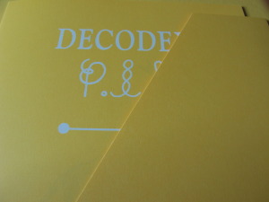
There is a Decodex pamphlet hiding in a pocket in the inside back cover of the volume that purports to be an explanation of the author’s inspiration and composition of the work, in several languages. This is undoubtedly a fraud, there is no way this work was composed without alien influence, without a mind too strange for ours to fully grasp. I recommend leaving it unread, unexposed, and the rest of the experience unspoiled by this unfortunate comforting fiction.

Ric Bretschneider
September 30, 2014

