I’m pleased to welcome our first guest post, by the prolific Hugo Award winning Christopher J Garcia. You can read more of Chris via his numerous fanzines and podcasts and undoubtedly occasional posts here on Book Judgement. I’m sure not all will be so criminal. -Ric Bretschneider
Crime Stories from The Strand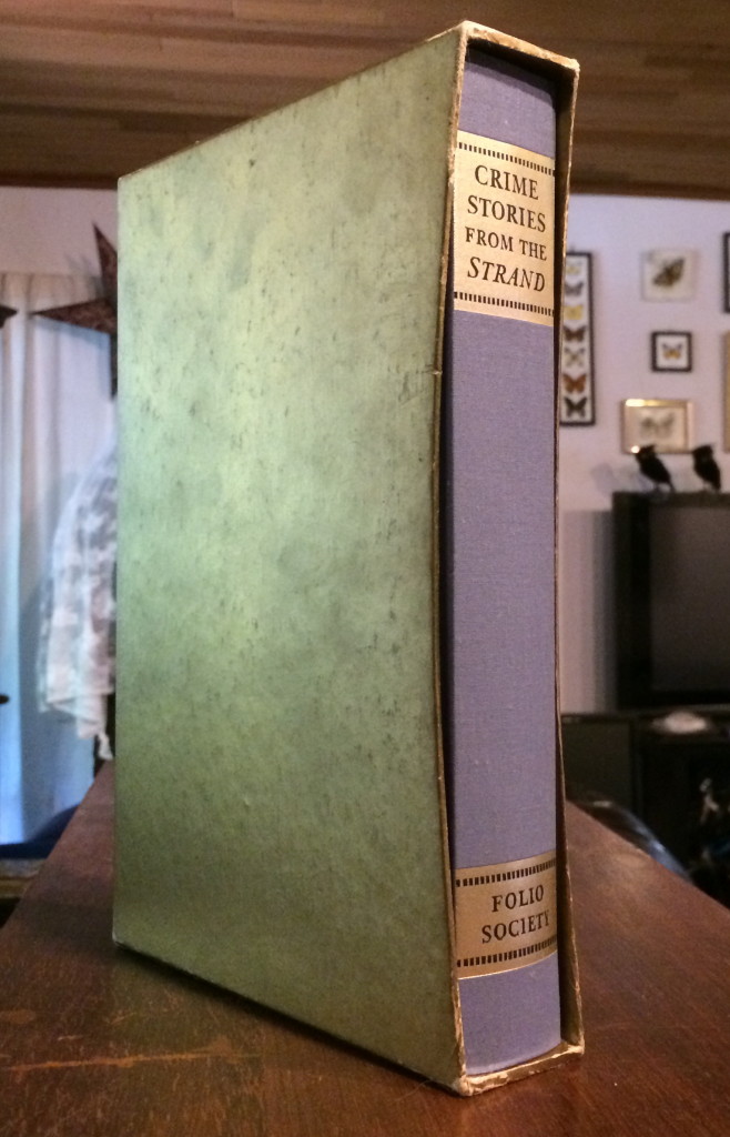
1991 London Folio Society

Review by Christopher J Garcia – AKA @johnnyeponymous
Why would you wrap a beautiful work of art in a plain bronze wrapper? It’s like the way Brighton Pavilion would cover over the lovely wallpaper and trim of one time period with the drab paint of the next. Sadly, that’s exactly what the folks at Folio Society have done with their release of Crime Stories of The Strand.
You remember the Strand, right? That hugely important English magazine that was the most important periodical from 1900 to the start of World War I. It was so popular that there was an American edition as well. HALF A MILLION copies a month. Imagine that happening today. It was an unstoppable jugglenaut of a magazine! Now, the London Folio Society put together this lovely collection of stories, ranging from Arthur Conan Doyle and G.K. Chesterton, to a certain Agatha Christie.
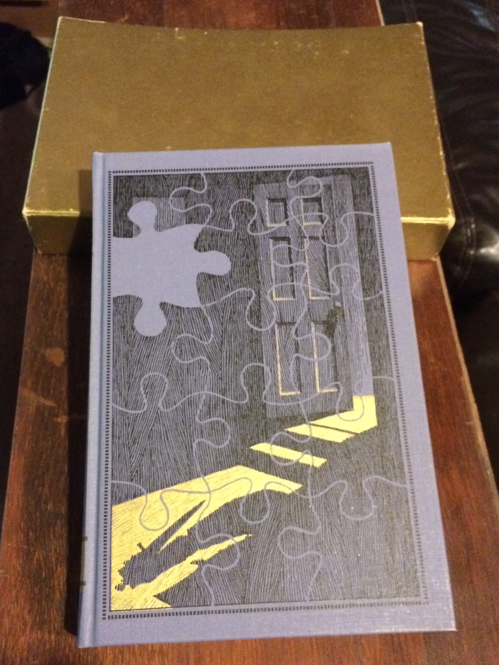
And the cover, a lovely puzzle-themed, two-color piece with exemplary cross-hatching and woodcut line work. It’s a marvelous work, lovely, giving off an Edward Gorey-like vibe. David Eccles The purple-blue of the hardcover shows through the black-and-gold printing and it’s spectacular.
Then the fools put a dull gold hard book box around it!
Why would you do that? There’s literally nothing on the case! It’s a dull gold box which gives no impression of what’s inside. The spine shows two chunks of gold background indicating the title and Folio Society. THAT”S IT! They completely obscured the incredibly beautiful image with that lame lamé case. It’s an unfortunate decision, and I’d keep it on the shelf not in the slipcase if it wouldn’t feel like it were no longer Mint In Box!
The choices for binding and hardcover board choices are pretty solid. The binding does have a certain stiffness to it, which leads to a cracking sound, perhaps aided by the fact that the whole thing is compressed every time you put it back into the dull gold slipcase! The outer fabric is the ideal cover tone, in that purple-blue that reminds me of pipe smoke in Grandpa’s den. The endpapers are in a lovely wine and is the perfect counterpoint to the purple-blue.
The typeface, Ehrhardt, is clear and feels somewhat antique, but not overly so. In fact, it feels Modern. Not contemporary, but solidly, and notably, modernist. I love that!
The book was designed by David Eccles, including the text and the binding, which shows in his artworks, which are not only line drawings, but also some beautiful stipple art. I love Stippling!
All in all, it’s a wonderful product, sturdy, with heavy paper and richly inked text. The edge coloring is in that same wine tone, which is only done on the top of the book, though it really doesn’t matter, BECAUSE IT’S COVERED BY THE BREAKING SLIPCASE!
It’s clear this work has been a labor of love, and obviously well-done, as you would expect from the London Folio Society!
Christopher J. Garcia
July 9, 2014